US Open Suite

2024

Event Branding

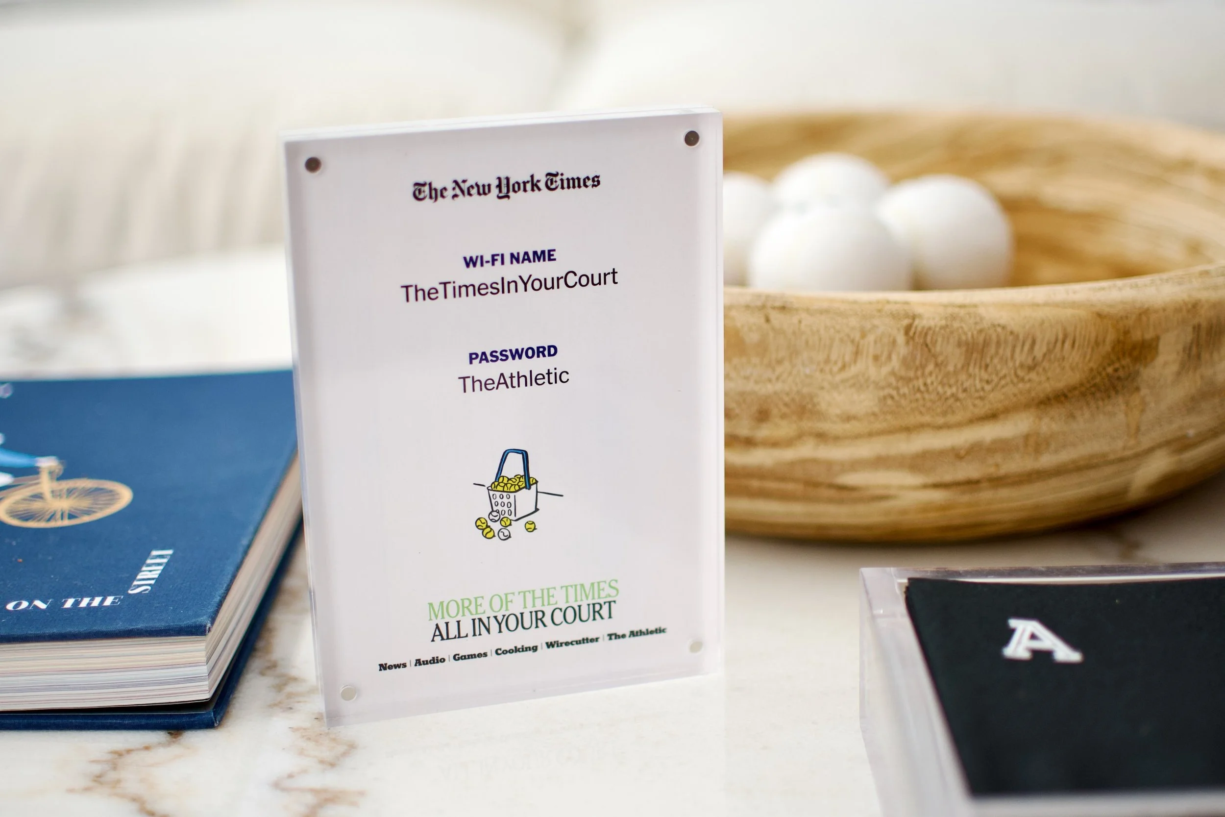
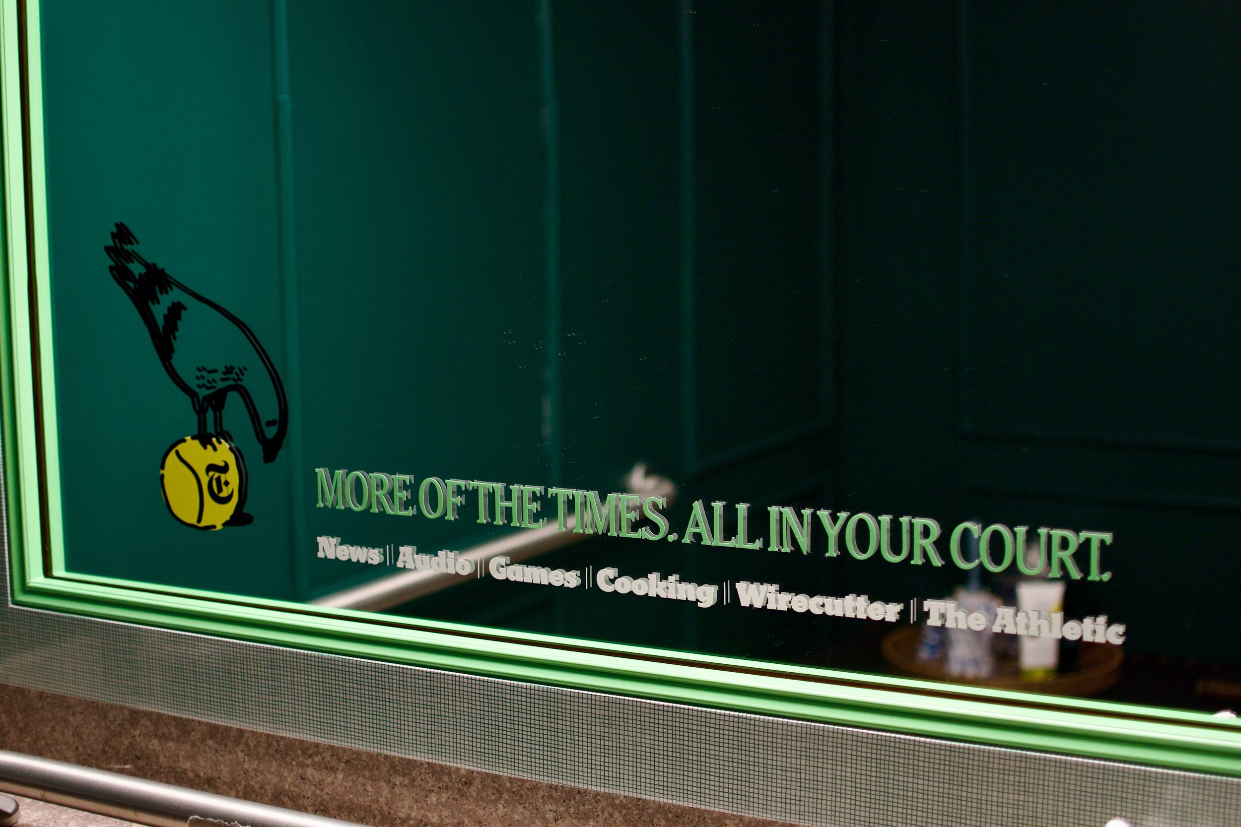
The New York Times has a suite at the Arthur Ashe Stadium where the US Open is held every year. This suite allows the NYT the opportunity to entertain clients at this iconic event. Our objectives were to bring the New York Times brand to life within the suite in impactful ways. Through collaboration with B2B Marketing, we designed an experience that fostered impactful connections with clients, enhancing brand presence and engagement throughout the event.

THE TEAM

Vida M Cornelious
Senior Vice President, Creative

Adam Okrasinski
Executive Director, Creative Tech & Design

Ellie Clayman
Design Director, T Brand Studio

Charlotte Rymar
Senior Designer, T Brand Studio

Jack Eiselt
Copywriter, T Brand Studio

Sara Mehta
Advertising Design Intern, T Brand Studio

Bari Komitee
Vice President, B2B Ad Marketing

Suzanne Hogan
Events Director, B2B Marketing

Jon Thornton
Senior Program Manager

Roxy Rosales
Senior B2B Events Manager

Arden Luthy
B2B Marketing and Events Intern

Rob Wilson
Freelance Illustrator

US Open Invites

US Open Illustrations
(Illustrated by Rob Wilson)

US Open Gallery Wall

US Open Bathroom

US Open Swag

US Open Honey Deuce/Thank you Card

US Open Wifi Sign

THE PROCESS

INITIAL DESIGN DIRECTION 1

The first visual direction we came up with was “The Times Tennis Club”. We wanted to take the concept of a tennis club and transform the NYT Suite. Some of the references we were pulling from included old NYT assets as well as vintage tennis court logos.

INITIAL DESIGN DIRECTION 1: VISUAL THEMES

Small Sketchy Illustrations

Using the Tennis Court
lines as a Grid

Vintage Illustrations as a Big Moment 

INITIAL DESIGN DIRECTION 2

The second concept we were playing around with was the “Bundle” and making it the focal point.

The “Bundle” refers to the portfolio of the New York Time’s sub-brands which includes Games, Audio, Cooking, etc. 

INITIAL DESIGN DIRECTION 2: VISUAL THEMES

Bright Color Palette

Bold Messaging Moment

Circles as our Main Theme

After conversations with B2B we decided to combine visual themes from both directions in order to create something fresh.

US OPEN: COLORS

We started by pulling colors from the Tennis court at Arthur Ashe.

US OPEN: TYPOGRAPHY

The second building block was the typography for which we used the beautiful NYT Chelt Cond. to give it a classic but modern feel.

SUITE VISIT AT ARTHUR ASHE

US OPEN: GALLERY WALL REVISIONS

The most challenging part about this project for me was the Gallery Wall with all the images showing the NYT Bundle. This gif shows all the revisions I made while making the wall mock.

US OPEN: SCARF R1

This is one of the Swag items. We wanted to try and design a beautiful silk scarf for guests to wear during the event. This is the first draft which I designed, sort of as a guideline for all the branding assets so we could see how everything printed.

US OPEN: HAT

This is some of the hat design process.

Next
Next

Patakha